github.com/jamescook/tryst-switch
0.1.0 / published Sep 1, 2026 / repository
A Bootstrap/iOS-style animated on/off switch for tryst - rounded pill track, antialiased thumb with a soft shadow, ~120ms eased slide plus a track color crossfade on toggle. Built on Tryst::OwnerDrawnWidget and rendered through tryst-vector.
tryst-switch
A Bootstrap/iOS-style animated on/off switch for
tryst, Crystal's Tcl/Tk binding — a
rounded-pill track, an antialiased thumb with a soft shadow, a ~120ms
eased slide plus a track color crossfade on toggle. Built on
Tryst::OwnerDrawnWidget and rendered through
tryst-vector — the flagship
"this is what a custom widget looks like in tryst" showcase (see
CUSTOM_WIDGETS.md
if you're building your own rather than just using this one).
require "tryst"
require "tryst-switch"

app = Tryst::App.new
switch = Tryst::Switch.new(app, value: true, text: "Dark mode")
switch.pack(padx: 16, pady: 8)

switch.on_action { |on| puts "switch is now #{on ? "on" : "off"}" }

app.show
app.mainloop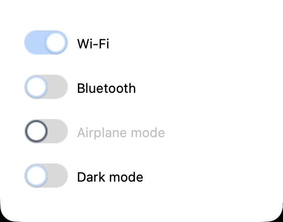
From examples/switch_demo.cr — run it yourself to see the slide and
crossfade.
It's just a widget: #pack/#grid place it, #value/#value= read
and set it (animating either way), #on_action fires only on a
user-driven toggle (click, Space, or Return while focused) — never for
a programmatic #value=, the same split tryst-value-slider's own
#on_change draws. Nothing about it being canvas-backed or
ThorVG-rendered is part of its own public surface.
There is no ui.switch/DSL bind: — a stateful, animated widget like
this one doesn't fit a registered WidgetType's narrow AppContract
(see CUSTOM_WIDGETS.md). A caller wanting two-way sync with a
Tryst::UI::Var wires it manually, same as tryst-value-slider's own
README documents:
switch.on_action { |v| var.value = v }
var.on_change { |v| switch.value = v }
size: is the one sizing knob (logical pixels, track height — track
width and thumb radius both derive from it). text:/label_side:
(:leading or :trailing) add an optional real Tk label beside the
pill — tryst-vector doesn't expose text yet (see its own README), so
the label is a real widget positioned with place, not drawn into the
Surface. accent: overrides the theme-derived on-color with a
#rrggbb hex string, same convention as tryst-value-slider/
tryst-spinner's own accent:. disabled_dim: (default 0.45, must
be in [0.0, 1.0]) controls how much the accent/track dim when
#disabled? is true — the one knob this widget exposes beyond its
siblings, for a caller that wants a different disabled look than the
default.
Interaction is click and keyboard (Space/Return while focused) only — no drag-to-toggle, matching how a real Bootstrap/iOS switch actually works.
See examples/switch_demo.cr for a runnable settings panel: two plain
switches, one disabled, and one whose #on_action drives a separate
status label.
Requirements
Whatever tryst and tryst-vector need — Crystal >= 1.21.0, Tcl/Tk 8.6, and ThorVG >= 1.0 (see tryst-vector's own README for per-platform package names and why).
Examples
crystal run examples/switch_demo.crTests
shards install
crystal spec                    # host
scripts/docker-test.sh          # Debian forky, same suite
scripts/docker-test.sh builds from this repo's own root; shards install inside the image fetches tryst and tryst-vector directly via
their github: dependencies. It takes the same arguments crystal spec
does, so a focused run works there too.
API
- Tryst
The Tcl-major-version auto-detection probe (TCL_VERSION=8/9 forces a choice; anything else auto-detects - see interp.cr's header comment for the full policy and why this needs to be a shell probe at all) used to be hand-copied verbatim at every {% if %}/{% unless %} site that needs it: twice in interp.cr, once in event_source.cr.